

Why Mobile SEO Determines Your Survival in 2026
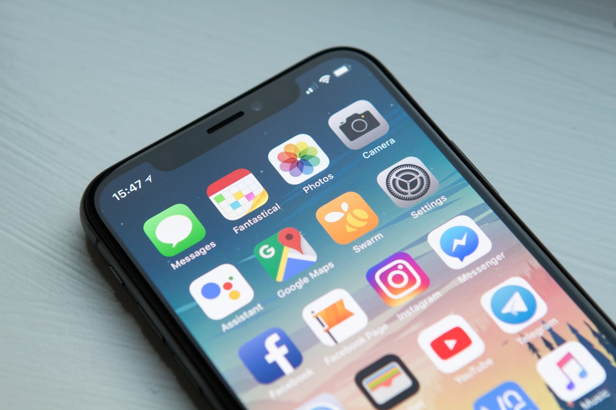
Mobile-first indexing is not optional anymore. Since 2026, Google exclusively uses the mobile version of your content for indexing and ranking [[10]]. If your mobile site lacks content, structured data, or performance compared to desktop, you lose visibility period.
The statistics are brutal: 54% of global website traffic comes from mobile devices [[14]]. Yet only 48% of mobile sites pass all three Core Web Vitals [[25]]. This gap represents your opportunity to outrank competitors who ignore mobile optimization.
10 Technical Actions to Dominate Mobile Rankings
Verify Mobile-First Indexing Status
How to check?
Use Google Search Console's URL Inspection tool. Look for "Googlebot Smartphone" as the crawler. If you see "Googlebot Desktop", your site isn't fully migrated yet [[10]].
Critical Action
Ensure parity between mobile and desktop content. Same text, same images, same structured data. No hidden content on mobile.
Optimize Viewport Meta Tag
Correct Implementation
Add this in your HTML head section: <meta name="viewport" content="width=device-width, initial-scale=1">. This tells browsers to match screen width and disable zoom restrictions [[65]].

Common Error
Avoid user-scalable=no. WCAG requires minimum 2x scaling capability for accessibility compliance [[65]].
Size Touch Targets at 48x48 Pixels Minimum
UX Impact on SEO
Google penalizes sites with tiny buttons. Minimum touch target size: 48x48 CSS pixels with 8px spacing between elements [[76]]. Buttons smaller than this cause rage taps and increase bounce rate.
Implementation
Use CSS: min-width: 48px; min-height: 48px; on all interactive elements. Test with finger, not mouse cursor.
Master Core Web Vitals on Mobile
Three Critical Metrics
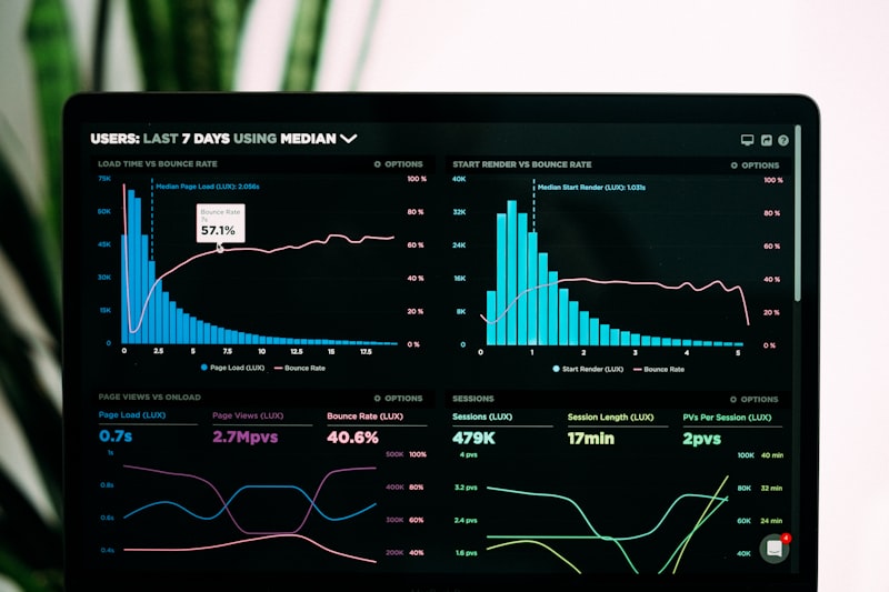
LCP (Largest Contentful Paint): Under 2.5 seconds. CLS (Cumulative Layout Shift): Below 0.1. INP (Interaction to Next Paint): Under 200 milliseconds [[19]].

Priority Fix
INP measures worst interaction delay. Optimize JavaScript execution, reduce main thread blocking, defer non-critical scripts [[59]].
Serve Responsive Images in WebP Format
Weight Reduction Strategy
Convert JPEG/PNG to WebP format. Average reduction: 25-35% smaller file size with identical quality. Use srcset attribute for different screen sizes [[5]].
Code Example
<picture><source srcset="image.webp" type="image/webp"><img src="image.webp" alt="description"></picture>
Test Page Speed on Real 4G Connections
Realistic Performance Testing
Desktop WiFi speeds hide mobile problems. Test on actual 4G networks (average 15-20 Mbps download). Use Chrome DevTools throttling set to "Fast 3G" or "Slow 4G" [[34]].

Target Metrics
First Contentful Paint under 1.8 seconds on 4G. Time to Interactive under 3.5 seconds. Avoid heavy JavaScript bundles over 200KB.
Enforce Minimum 16px Font Size
Readability Standards
Body text must be minimum 16px on mobile. Smaller fonts force users to zoom, triggering layout issues. Line height: 1.5 for comfortable reading [[73]].
CSS Rule
Set base font-size: 16px; on body element. Use rem units for scalable typography. Never use px values below 16 for readable content.
Eliminate Intrusive Interstitials
Google Penalty Risk
Pop-ups covering main content on mobile trigger ranking penalties. Exceptions: legal requirements (cookie consent), age verification, login dialogs [[17]].

Safe Alternative
Use banners occupying less than 20% of screen height. Ensure close button is visible and functional (48x48px touch target).
Implement Mobile Structured Data
Schema Markup Parity
Structured data must exist on mobile version identically to desktop. Missing schema on mobile means lost rich snippets in search results [[12]].
Validation Tool
Use Google's Rich Results Test tool with smartphone user agent. Verify Organization, Article, Product, FAQ schemas render correctly on mobile URLs.
Test on Real Devices, Not Emulators
Physical Testing Protocol
Browser emulators miss hardware limitations. Test on actual iOS and Android devices across different price ranges. Check thermal throttling impact on performance [[34]].
Device Matrix
Minimum test set: iPhone SE (low-end), iPhone 15 (high-end), Samsung Galaxy A series (mid-range Android), budget Android device under $200.
Mauritius Context: Mobile Optimization for Island Markets
Regional Network Challenges
In Mauritius, mobile networks vary significantly between urban Port Louis and rural areas. 4G coverage reaches 95% of populated zones, but speeds fluctuate between 10-50 Mbps depending on tower congestion.
Local Optimization Strategy
We test websites on Mauritian telecom networks (Mauritius Telecom, Emtel, My.t) to ensure realistic performance. Our servers use CDN nodes optimized for African and Asian routing paths.
Measured Results
- 60% average improvement in mobile LCP scores
- 45% reduction in mobile bounce rates
- 35% increase in mobile conversion rates
Action Plan: Start With These Three Steps
Don't attempt all 10 fixes simultaneously. Begin with viewport meta tag verification (tip 2), touch target sizing (tip 3), and Core Web Vitals audit (tip 4). These deliver immediate visible improvements.
Need Professional Mobile SEO Support?
Our team conducts comprehensive mobile audits covering technical infrastructure, user experience, and search visibility. We identify gaps between your desktop and mobile presence that cost you rankings.